Showing posts with label newton. Show all posts

Thursday, December 20, 2012

Shopping at the Artiste Gallery in Mansfield

Finish up your holiday shopping at the Artiste Gallery in Mansfield. It is an eclectic shop with merchandise crafted by local artists.


Recently, I was at the Artiste Gallery for an event.  What a great shop, featuring local artists and crafts people.  The items range form paintings to jewelry to homemade bath products and wood carvings.  The intimate shop is located on 263 North Main Street in downtown Mansfield.  What a great place to find something unique for the person who has everything.

Dotty Wyman is the principal designer at www.dottywymandesigns.com. Also, like me at www.facebook.com/dottywymandesigns.

Tuesday, October 23, 2012

Decorating with Paint - 2

The  Sherwin William's website takes a different approach to showing us the new color trends for 2013.  They provide an inspiration and then colors that project that feeling.  I have copied some of their insights to this page for you to see.  I like having two different approaches available.  Each time I start with a space I will use alternate ways to get started.  In this case I want to start with the color palette first.

The caption from Sherwin William's color trend page says, "Today's dynamic palettes reflect our diverse mindsets, lifestyles and design philosophies."  Below are the pictures and inspiration for their color trends.

Midnight Mystery

The colors are moody, the vibe is masculine and the aesthetic is both Victorian and futuristic.
SW - 2013 Forecast - Midnight Mystery Thumb

There are many deep rich colors in this color grouping.  The 3 I like most are;

SW 7593 - Rustic Red
SW 7593
 
SW 6131 - Chamois
SW 6131
 
 
SW 6004 - Mink
SW 6004


The colors are chalky and earthy, the materials raw and organic, the finishes matte.              
SW - 2013 Forecast - Honed Vitality Thumb
 
These colors are cool neutrals.  My top 3 are;
 
SW 7612 - Mountain Stream
SW 7612
 
SW 7739 - Herbal Wash
SW 7739
 
SW 7057 - Silver Strand
SW 7057
 
 
The pastels are a bit bolder, including semi-precious gem tones like citrine, peridot and amethyst, set off by crisp neutrals.         
SW - 2013 Forecast - Vintage Moxie Thumb
 
I agree these are bold pastels.  The 3 I think are most versatile are;
 
SW 0074 - Radiant Lilac
SW 0074
 
SW 0025 - Rosedust
SW 0025
 
SW 6401 - Independent Gold
SW 6401


Electronics, alternative rock and digital technology — plug those influences into one socket and you get a blast of high-voltage look-at-me colors.               
SW - 2013 Forecast - High Voltage Thumb
 
Pops of color can be very exciting in a room's decor.  My favorites;
 
SW 6859 - Feverish Pink
SW 6859
 
SW 6967 - Frank Blue
SW 6967
 
SW 6921 - Electric Lime
SW 6921
 
Some of these new colors are extremely bold and dark.  There are options available in the same color family that are softer and or lighter.  You can get more colors and details about Sherwin Williams trends for next year on their website www.sherwin-williams.com.

Dotty Wyman is the principal designer at www.dottywymandesigns.com. Also, like me at www.facebook.com/dottywymandesigns.


Tuesday, October 2, 2012

Decorating with Paint - 1

Do you want to freshen up a room with a new paint color?  Add new color accents to a neutral room with pillows, window treatments or upholstery fabric?  I am selecting some colors for a room I am designing and I needed some inspiration.  Currently, the room is a blank slate, so I have the opportunity to add color with paint, fabric and artwork.  The first place I checked out was the Benjamin Moore website to see their forecast of colors and was pleasantly surprised with all the color options and interesting color combinations they provided.

The trend colors for the 2012 section gave me ideas of new colors to mix together.  I noticed that gray, teal and burgundy/purple colors are very current.  Neutrals are always needed and Benjamin Moore helps you use them in different ways.


The two rooms above us the same color pallet, but in completely different approaches.  I like the dark trim in the first photo.  It is a unique twist from the traditional white or off white trim color.  The second picture has a sky blue ceiling with the dark walls.  This adds an extra dash of color and life to the dark green room.  The same colors were used in both rooms, but they have been used in varying locations.


The two views of this mirrored chest and artwork look completely different, even though the grouping of colors is the same.  The difference is the dominant color on the wall.  The first photo has a blue wall with red and dark taupe accent colors in the twigs.  The second photo uses the dark taupe on the wall and blue and red accents in the artwork and accessories.  I like that the same chest can have a traditional look and a more contemporary look just by changing a few accessories.

The Benjamin Moore website was fun to use for new ideas.  The 2012 trend colors can be viewed using the link provided.  http://www.benjaminmoore.com/en-us/for-your-home/color-trends-2012;jsessionid=HvJ1QpnBPNplk1xSzrKhQdKvz4W6H32J3bCNdDLDpJ3Qgvs8nJ3S!1556887689!NONE

I also viewed the Sherwin Williams website.  I will let you know what I found on this site next.

 Dotty Wyman is the principal designer at www.dottywymandesigns.com. Also, like me at www.facebook.com/dottywymandesigns.


Monday, April 2, 2012

Contemporary Farmhouse Style Kitchen

This is a kitchen remodel I worked on last spring with a client.  She had lots of exciting ideas and was willing to expand the existing footprint of the kitchen.  The most challenging part of this project was fitting together cohesively all of the elements she wanted to include.  We successfully collaborated to create a new welcoming, more efficient kitchen the whole family likes to use.

The group of before pictures, shows a kitchen footprint that a family of four used every morning and evening together.  The table in the center was added for additional counter space, but took up valuable square footage and created a narrow passage through the kitchen in front of the refrigerator.


The client wanted a new larger kitchen with a contemporary farm house style.  First, the kitchen was bumped out 6 feet and a large new window was added over the sink.  The desired design was achieved by adding painted cabinetry, exposed beams, a large rustic black hammered metal hood and soapstone counter tops.  The cabinetry has inset doors which is a classic style for older built-in cabinets.  The rustic hood is the center of attention and is enhanced by the tiled wall behind it.  The open shelving on either side keeps your focus on the beautiful hood.  We opted to use recessed lighting, so the look of the beams would not be interrupted.  Finally, a long center table was added for more work space.  The base is made of reclaimed wood and the top is covered in stainless steel.  This kitchen now has the style the client envisioned and it is functional for her family.


Dotty Wyman is the principal designer at www.dottywymandesigns.com.    Also, like www.facebook.com/dottywymandesigns.

Tuesday, January 24, 2012

Decorating Dining Room - Accessorizing (8)

Finally, I have accessorized my new dining room.  I am happy to say, the last couple of months have been busy, so I haven't had much time to work on my own space. 


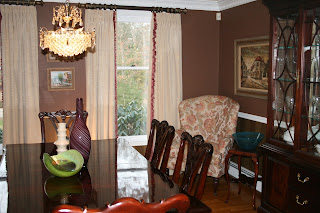
The accessorizing step of a design project is extremely important for providing the room a finished and pulled together feeling. Since the walls in my dining room are chocolate brown and the furniture is mahogany, I wanted to bring in some bright pops of color. I am able to do this with brightly colored glass bowls and vases.  Some of the artwork on the walls has white matting to add lightness too.  Without these accessories the room would look dull and uninteresting.


Accessorizing a room is time consuming.  Many times items that look great in the store, don't work as well in your home.  The goal is to have accessories that fit the room's new design and that you like them.  Also, in my project I wanted to reuse some of the items in the room, because these pieces had special meaning to me and my family.  Items that appeared dated were stored away.


My dining room isn't 100% complete.  I plan to add the mirror, pictured below, to the wall above the chest of draws and some type of throw on the dining table.  Please write me any comments or questions you may have about this redesign project.


Dotty Wyman is the principal designer at www.dottywymandesigns.com.

Wednesday, September 14, 2011

Redecorating Dining Room - Paint and more (6)

The dining room project is once again moving along.  When the rain came, so did the painter for some interior work.  He called me on Tuesday last week and was there on Thursday to start the job.  Since I had already selected the colors for the room and ordered the wallpaper, he could come even on such short notice.  The work to replace the baseboard moulding, wallpaper and paint was completed in two days.  They accomplished everything I requested.  There were only 2 small changes to the original estimate, which the painter confirmed with me prior to starting.

A view of the overall look of the walls

The picture above shows the rich brown paint on the upper portion of the walls which is balanced with the bold striped wallpaper below the chair rail.  The 2 3/4" baseboard moulding has been replaced with 7 3/4" moulding (the same height as the heat registers) and all the trim has been painted with a fresh coat of white paint.  I decided to paint the ceiling a golden yellow color (pictured below).  I thought the color on the ceiling would give the room a more contemporary feeling and it was an opportunity for me to introduce the yellow color from my design inspiration photos into the room.

Below are a few more detailed pictures of the walls and ceiling.

The 7 3/4" baseboard adds a strong architectural detail


The baseboard heat has also been painted white to blend
with the baseboard moulding


The yellow painted ceiling is unexpected and helps to
accentuate the crown moulding

The dining room redesign is almost complete.  The window treatments are the next step in my project plan.  I am in the process of making the drapes and I have ordered the decorative drapery rods.  

Please write me any comments or questions you may have about this redesign project.


Dotty Wyman is the principal designer at www.dottywymandesigns.com. 


Friday, January 14, 2011

Kitchen remodel completed

The kitchen remodel project is nearly complete and I wanted to share some before and after photos with you. As mentioned in previous blogs, this kitchen remodel consisted of replacing the gray tile floor with oak hardwood, adding molding and painting the existing oak cabinetry, replacing the white tile backsplash with marble subway tile, painting the walls and ceiling and upgrading the stove and sink.

 The first pictures are views of the refrigerator and small counter area.  The microwave was relocated to this seldom used counter space and was given a built in appearance with side brackets.  Notice the large moldings that were added to the tops of the upper cabinets and the molding on the sides of the cabinet boxes (upper and lower).  These additions make these cabinets look more custom.  Feet have been added to the toekick  as well.  The black granite and the tile add to the traditional and timeless feeling of the new kitchen.


The next two views are of the kitchen sink and cabinetry around it.  The crown molding and molding along the bottom of the upper cabinets add detail and they become a focal point for the kitchen.  These pictures show more of the movement and color changes in the marble tile.  Marble is beautiful, but it can stain.  Using it as the backsplash allows you to add it to a new kitchen without the worry of damage.


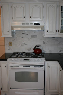
 The black stove has been replaced with a white one that blends in seamlessly with the painted cabinets and now matches the other appliances.  We moved the microwave next to the refrigerator, opening up additional counter space in the important work area of the kitchen.


The desk was transformed as well.  The crown molding adds architectural detail and interest to the upper portion of the desk.  The glaze settles into the ridges and makes them more defined.  The feet at the bottom make it look more like a piece of furniture.  The final change was replacing the formica counter top with a white marble that coordinates with the marble backsplash.  Since this is the desk area there is less chance for it to be stained.  You can see the oak flooring and taupe walls in these pictures which makes the desk look great and warms up the kitchen.


Finally, I have included a few close up pictures that show some of the detail added to the kitchen.  The corbels under the extended island top adds the appearance of support for the granite overhang.  We added molding to the top of the cabinets, but also added 7 1/2" baseboard molding to the floor.  This a great detail and helps to disguise the radiators.


I hope these before and after pictures of this kitchen remodel have inspired some ideas for your kitchen.  Please send me any comments you may have.

Dotty Wyman is the principal designer at www.dottywymandesigns.com.